CSS Grid is a powerful layout system that allows you to design complex web layouts with ease. It provides a two-dimensional grid-based layout system, enabling you to create rows and columns for positioning and aligning elements within a webpage. Unlike traditional layout methods like floats or positioning, CSS Grid offers more control over the placement of elements, making it easier to create responsive and flexible designs. With features like grid-template-columns, grid-template-rows, grid-gap, and grid-template-areas, you can create intricate layouts that adapt to various screen sizes and devices. CSS Grid simplifies the process of creating sophisticated layouts, making it a valuable tool for web developers and designers alike.
Creating a Basic Grid Layout with CSS Grid
In the following example:
- We have a container div with the class “grid-container” that holds six child divs with the class “item”.
- We apply CSS Grid layout to the container by setting its display property to “grid”.
- We define the layout of the grid using the grid-template-columns property. In this case, we create three columns of equal width using the “fr” unit, which stands for fractions.
- We set a gap between grid items using the grid-gap property.
- Each item inside the grid container inherits the grid layout properties and is styled with a background color, padding, and text alignment for better visualization.
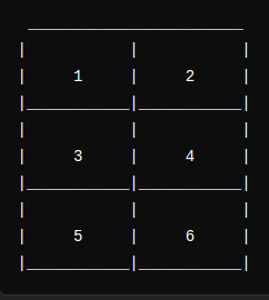
This creates a grid layout with three columns, each containing one of the child divs. You can adjust the number of columns, their width, and the gap between items to create different layouts as needed.
HTML:
<div class="grid-container">
  <div class="item">1</div>
  <div class="item">1</div>
  <div class="item">1</div>
  <div class="item">1</div>
  <div class="item">1</div>
  <div class="item">1</div>
</div>
CSS:
.grid-container {
  display: grid;
  grid-template-columns: 1fr 1fr 1fr; /* Three equal-width columns */
  grid-gap: 10px; /* Gap between grid items */
}

.item {
  background-color: #ccc;
  padding: 20px;
  text-align: center;
}
Representation of the grid layout:
Empowering Responsive Design: The Role of CSS Grid
CSS Grid simplifies the creation of responsive designs by providing a flexible two-dimensional layout system. It enables developers to define grids with rows and columns that adjust automatically based on the available space. With features like flexible grid tracks, automatic item placement, and media query integration, CSS Grid allows for the creation of layouts that adapt seamlessly to different screen sizes and device orientations. This makes it easier to build responsive websites that provide optimal user experiences across a wide range of devices, from desktops to tablets and smartphones.
CSS Grid vs. CSS Flexbox:
- Layout Model:
- CSS Grid: Two-dimensional grid-based layout system, allowing for both rows and columns.
- CSS Flexbox: One-dimensional layout model, focusing on alignment and distribution along a single axis (either row or column).
- Control:
- CSS Grid: Offers more control over the layout, with precise positioning of elements in both rows and columns.
- CSS Flexbox: Provides flexible control over alignment and distribution along a single axis, making it ideal for more linear designs.
- Complexity:
- CSS Grid: Suited for complex layouts requiring alignment in both rows and columns, making it perfect for overall page layout.
- CSS Flexbox: Ideal for simpler, one-dimensional layouts such as navigation menus or lists.
- Responsiveness:
- CSS Grid: Simplifies responsive design with features like automatic item placement and media query integration, making it easier to adapt layouts to various screen sizes and device orientations.
- CSS Flexbox: Also supports responsive design but may require additional workarounds for complex layouts involving multiple axes.
Why CSS Grid is Superior:
- Two-Dimensional Layout:
- CSS Grid’s ability to handle both rows and columns simultaneously provides a more comprehensive solution for layout design compared to Flexbox’s one-dimensional approach.
- Granular Control:
- CSS Grid offers finer control over layout placement and alignment, allowing developers to create intricate designs with ease.
- Adaptability:
- With features like flexible grid tracks and media query integration, CSS Grid simplifies the creation of responsive designs that seamlessly adapt to various screen sizes and device orientations.
- Versatility:
- While both Grid and Flexbox have their strengths, CSS Grid’s versatility makes it suitable for a wider range of layout scenarios, from basic grids to complex multi-column layouts.
In summary, while both CSS Grid and CSS Flexbox are powerful tools for layout design, CSS Grid’s two-dimensional nature, granular control, adaptability, and versatility often make it the superior choice for modern web design needs, especially when dealing with complex layouts and responsive design requirements. Still you can incorporate both and use both at the same time in your project.
Conclusion:
CSS Grid emerges as a revolutionary force that empowers developers and designers alike to sculpt intricate layouts with unprecedented fluidity and adaptability. Its innovative two-dimensional grid system transcends the confines of traditional layout methods, granting meticulous control over element placement and alignment while seamlessly accommodating the demands of responsive design. From crafting elegant grids to orchestrating complex arrangements, CSS Grid revolutionizes the design process, facilitating the creation of dynamic interfaces that seamlessly adapt to an ever-expanding array of devices and screen sizes. As we push the boundaries of digital creativity, CSS Grid stands as a beacon of innovation, reshaping the landscape of web design and propelling us towards new frontiers of possibility.


