tl;dr
Work should be fun and challenging. At Keitaro, we always try to make work fun. Business or technical limitations paint the limits of our challenges but do not limit our creativity. These limitations help us learn new things and make us better at what we do, every day.
Following is a deep dive into the process of making a simple image generator for Keitaro’s Marketing department.
How It All Started
Keitaro’s Marketing department is always here to support the business. They produce all kinds of visual materials to promote our brand and to produce all of our campaigns across social media. So, the story of the Blog Image Generator, or BIG as we’d like to call it, is a story about optimization – give our Marketing team a jump-start with the visual design work and multiply their free time for other exciting projects.

We decided to create a simple tool for image compositing purposes, specifically for the visual content of the Insights page on our website.
Every time we publish a new post, we like to support it with at least one engaging image that addresses the post topic, through the visual language of our brand. This might seem very vague, but it simply represents a visually appealing image with several key elements – a headline, some graphical icon or element, a background color or image, one or multiple gradients on top and that’s about it. Voila… we have the initial scope of our BIG project.
Constraints
BIG is a tool that must work on all platforms and devices. It has to be easy to use and must not require any special effort from the users. It simply needs to just work.
The only platform that we know works across all devices is the Open Web Platform, so we’re going to build BIG as a Single Page Application (SPA) and a Progressive Web App (PWA).

We’ll rely on React, Context, Bootstrap 5, Bootstrap Icons, and the relevant existing APIs of the Open Web Platform, but we still want to keep dependencies as low as possible.
CSS Grid, Flexbox, Gradients, Blend Modes, Transforms, and many more of the current additions to CSS, will support us along the way.
Use Case
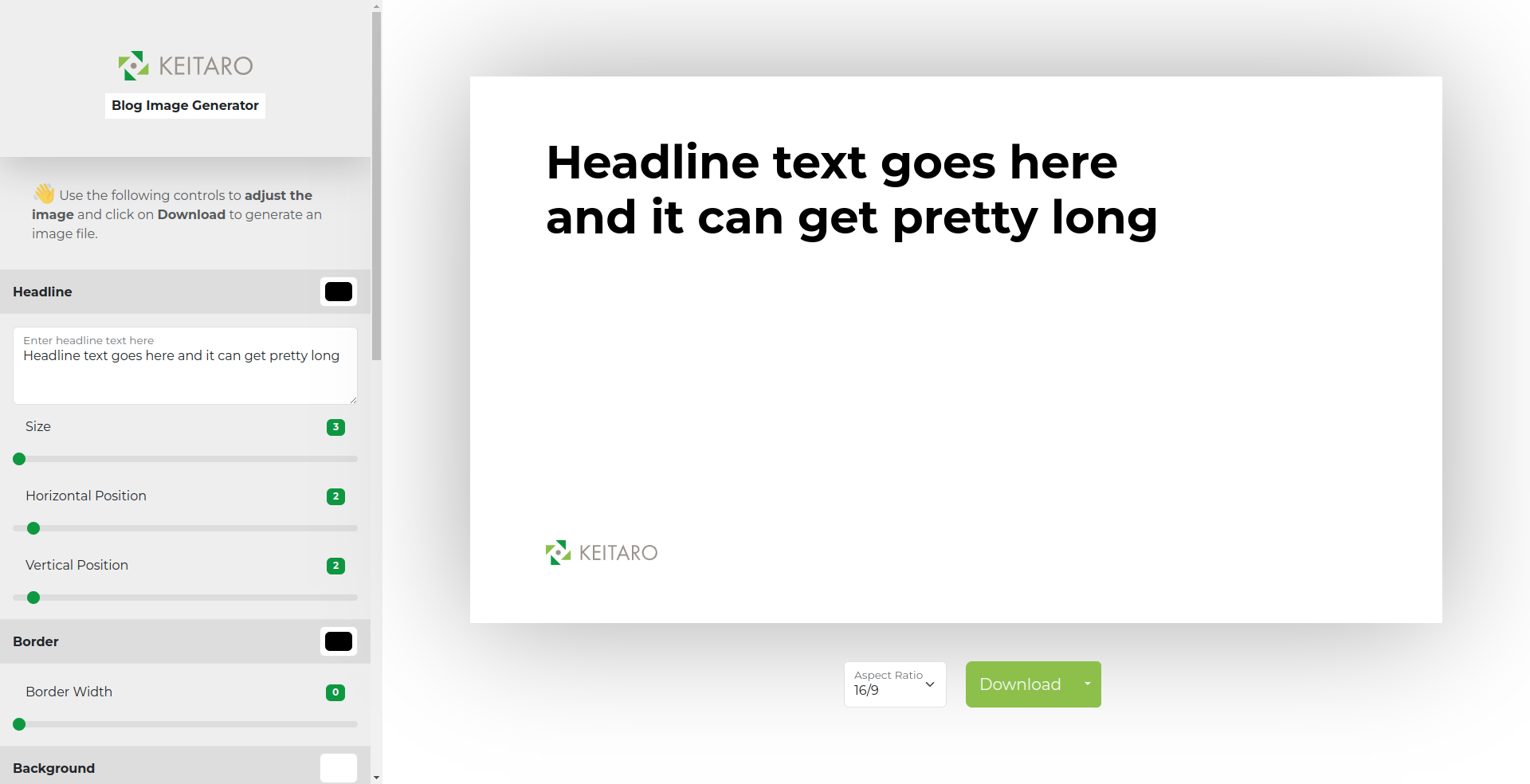
BIG is a simple image compositing tool. The user can create an image suitable for sharing across various media with minimum effort.
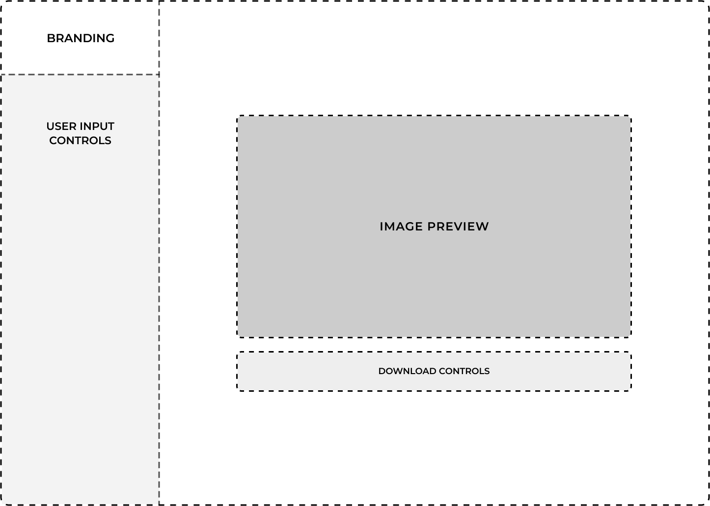
Changes are made live and the preview of the composited image is always up-to-date. As soon as the user makes changes through the provided controls, the preview is redrawn. Using scale, padding, positioning, borders, gradients, and colors the user can create an engaging image in a very short amount of time – let’s say in about half an hour.
And not just that, we want the user to have control over the aspect ratio of the final image and to download an image that does not require additional editing with external software applications.
Process
We assembled a dedicated team of two front-end developers with excellent knowledge of React. They closely followed a design mock-up, provided in Figma.
Work was planned within a time frame of just two weeks and we made it!
Developer Experience
Developers worked by following the best practices in using all of the relevant tools and technologies. The implementations were very simple and generic. The code was reusable and split into as many UI components as possible.
Work was organized within feature branches and new code could only be merged within the main branch through a pull request (PR). Each PR needed to be approved by a team member, before merging.
User stories were represented as tasks on a project board and each developer could take on new work from a list of existing tasks – marked as TODO. As work progressed, different tags were assigned to the relevant tasks, until they reached their final state of DONE.
Part of the manual work was automated through GitHub Actions. We had one action for the code linting check and another one for the deployment. Every time something was merged into the main branch, a new deployment to GitHub Pages was initiated. Every time the committed code was incorrectly formatted, the linter threw errors. These could be fixed with Prettier, with just a single npm command.
Result
Two weeks later, we completed BIG – our shiny new image generator.
To support our Marketing team and help them transition to BIG, we prepared a detailed How to Use wiki page.
But BIG is not just ours, it is now accessible to everyone on the web, under the Apache License – Version 2.0. We are open to feedback and contributions from the open-source community, so if you’re interested, make sure you check out https://github.com/keitaroinc/blog-image-generator.
If you’d like to just learn more about the project in general, start from the BIG Wiki.
Conclusion
Projects like the Blog Image Generator help us get outside our comfort zone, unleash our creativity and full potential, learn new things, benefit from constraints, and pay tribute to the days we were just starting with Front-end Development, User Interface, and User Experience design.
It was a fun ride. Thanks for reading.
